
Soft: A Queer Film Magazine
SOFT explores bold, intimate, and innovative queer cinema, spotlighting micro-budget filmmakers, trans-led storytelling, and London’s emerging film movements. Featuring interviews, essays, and critical insights, it champions authentic LGBTQ+ voices redefining representation and reshaping contemporary film culture.
Logo Design
Heavily inspired by classic queer film posters, the design seeks to bring each article to life in a conceptual framework.
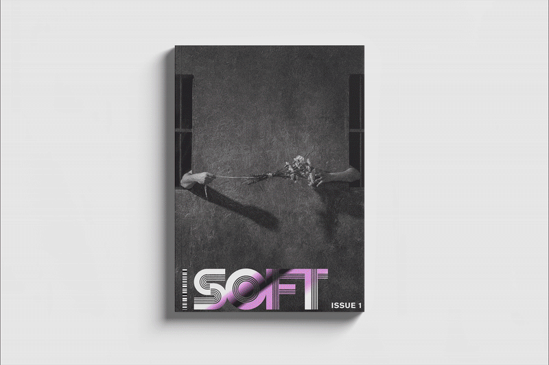
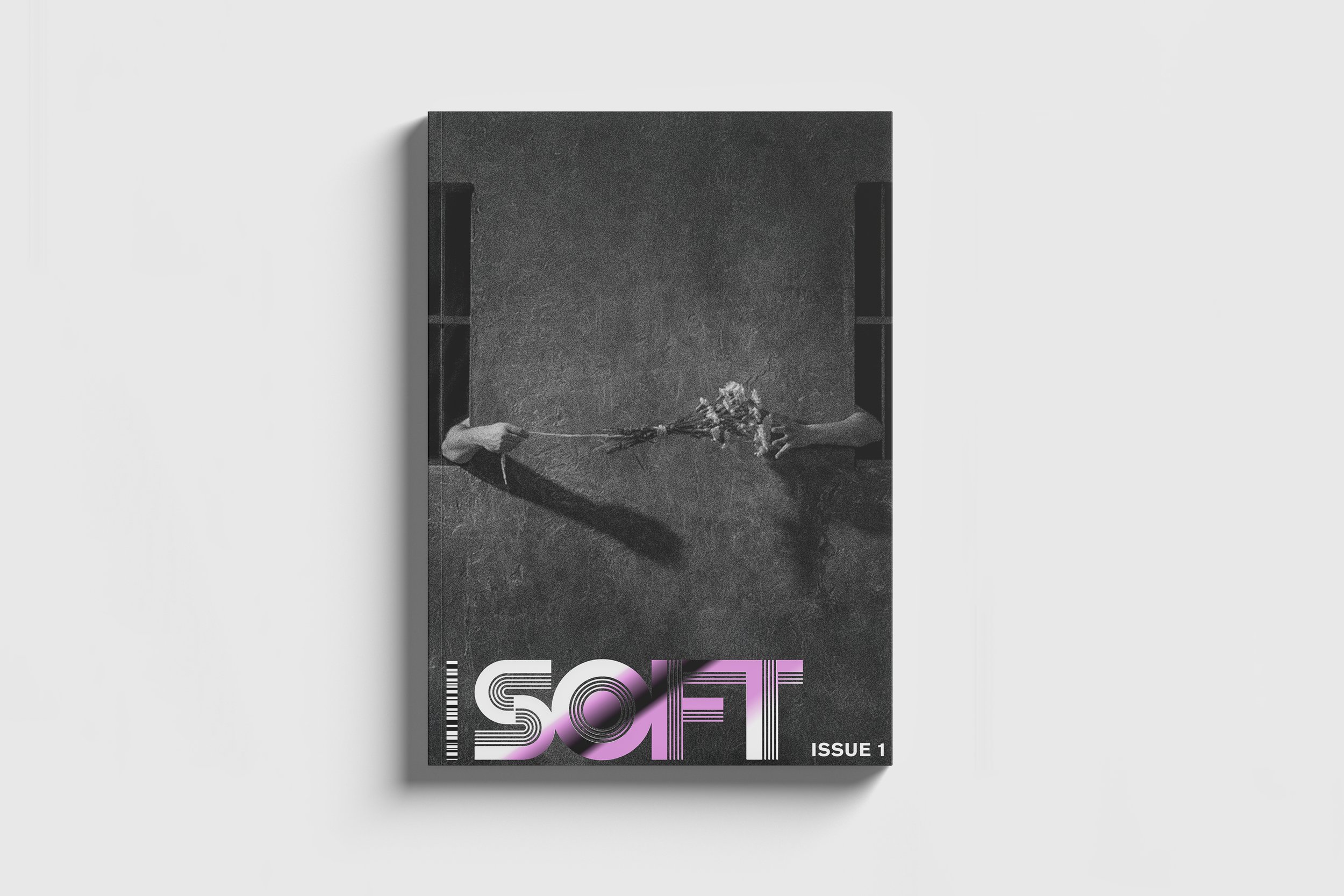
The logo design comes from the poster design of James Bidgood's Pink Narcissus, and the cover is a still from another queer favourite of mine, Jean Genet's Un Chant D'Amour.
Grid Layout
The grid layout is 6 columns to reference the Kinsey Scale.
Using a six-column grid can act as a subtle structural nod to the Kinsey scale, which spans zero to six. In a queer magazine layout, this becomes a quiet conceptual layer: the framework itself echoes the idea of sexuality existing on a spectrum rather than in fixed categories. It doesn’t dictate content, but it reinforces the publication’s thematic stance through the underlying architecture of the page.